
The gray part of the Tax Map is the effective marginal tax rate (the tax rate paid on each additional dollar of income) and the red represents regular tax brackets.
Tax Clarity is designed to bring a coherent view of tax complexities to advisors and their clients.
Check out this video explanation:
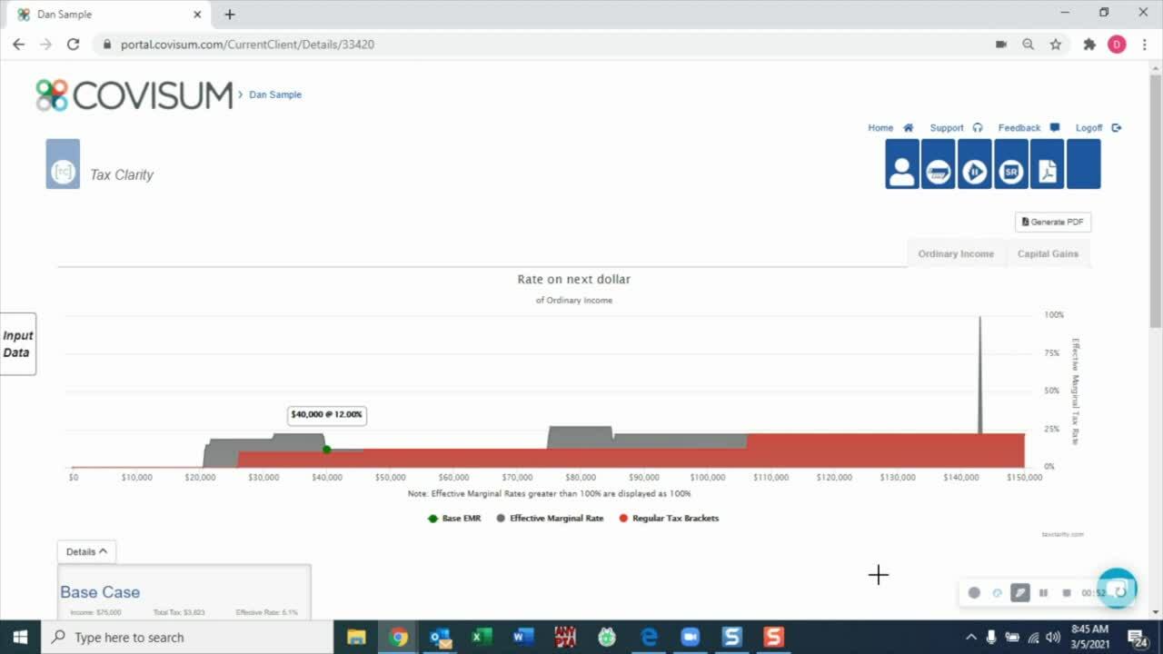
Below is a sample output including the Tax Map and calculation details.
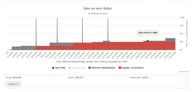
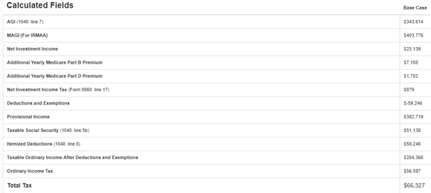
The green dot represents the base effective marginal rate (EMR) for the data points used to generate the results. The effective marginal rate is average tax rate paid on an additional dollar of income. In this case the EMR is 27.8% on $292,476 of ordinary income. At this point we might expect that the EMR is 24% based on the regular tax brackets which is represented by the red brackets on the map. However, the Net Investment Income of $23,139 caused additional investment tax which is why we have 3.8% increase in the effective tax rate.
Other tax increases include:
Medicare Part B & D premiums based on reaching IRMAA thresholds. You should note that the increase in premiums are not represented on the tax return but should be considered in the overall retirement distribution plan. Tax Clarity illustrates these increases by showing the EMR increasing at the threshold up to 100% effective marginal tax rate. Tax Clarity does allow you to exclude these increases from the analysis.
Social Security benefits become taxable based on the provisional income formula calculation which considers income distributions to determine whether benefits are taxable or not. Typically, Tax Clarity illustrates Social Security taxation by increases at the start of the tax map before the regular tax brackets.